The core purpose of “One Click” Apply is to save Applicants time searching for housing assistance. Some Housing Authorities have long waiting lists and the process for rental assistance can take years.
The core purpose of “One Click” Apply is to save Applicants time searching for housing assistance. Some Housing Authorities have long waiting lists and the process for rental assistance can take years.
The core purpose of “One Click” Apply is to save Applicants time searching for housing assistance. Some Housing Authorities have long waiting lists and the process for rental assistance can take years.
UX/UI Design
My Role
My Role
Collaborate with development and product team to determine project scope.
Create visual assets to help communicate product feature.
Update existing Applicant flows to support “One Click” Apply feature.
Collaborate with marketing team and support team to make sure whatever copy writing I explored is in sync with knowledge base and marketing rollouts.
Key Problems
Key Problems
The capability to re-use applications already exists in database and code base but isn’t being communicated in the interface clearly to Applicants.
Proposed Solutions
Proposed Solutions
Add a view to Property Details pages CTAs that includes branding of new feature.
Inform Applicants after first time applying of new feature.
Include information about One Click feature when user attempts to create a new Renter account from the Property Details pages.
New Workflow
New Workflow
I chose to start my process with a flow diagram so that management and the product team were aware of any UX changes that could impact sales. Adjusting pricing pages can impact business objectives so I wanted to make sure everyone was equally bought in before investing any time with solutions or development.
I chose to start my process with a flow diagram so that management and the product team were aware of any UX changes that could impact sales. Adjusting pricing pages can impact business objectives so I wanted to make sure everyone was equally bought in before investing any time with solutions or development.
This diagram also enabled developers to gain insight into any potential issues with design solution feasibility as well as the ability to assess development effort vs design R.O.I.
This diagram also enabled developers to gain insight into any potential issues with design solution feasibility as well as the ability to assess development effort vs design R.O.I.


Iconography Explorations
Iconography Explorations
I managed to keep the One Click apply icon as functional as possible while trying to introduce some delight, personality and simplicity.
I managed to keep the One Click apply icon as functional as possible while trying to introduce some delight, personality and simplicity.
For iteration V2.0 I focused on matching the 2 word feature phrase with a literal set of icons for the sake of simplicity and our target audience understanding the pair of images without pairing the icons with text. After a few rounds of design reviews and product team alignment I went ahead and put together V2.0. This exploration expanded on the first icon variation but featured the 2 word phrase housed inside a file icon. We felt like this would be the strongest approach to visualizing the feature because Renters were already used to seeing file icons inside of the exist Affordable Housing ecosystem. We expanded upon the “wheel” instead of reinventing it.
For iteration V2.0 I focused on matching the 2 word feature phrase with a literal set of icons for the sake of simplicity and our target audience understanding the pair of images without pairing the icons with text. After a few rounds of design reviews and product team alignment I went ahead and put together V2.0. This exploration expanded on the first icon variation but featured the 2 word phrase housed inside a file icon. We felt like this would be the strongest approach to visualizing the feature because Renters were already used to seeing file icons inside of the exist Affordable Housing ecosystem. We expanded upon the “wheel” instead of reinventing it.


Success Modal Explorations
Success Modal Explorations
Before we get into the final design exploration breakdown here are 4 alternative designs that I explored for the application submission success modal. I tried to introduce the One Click branding in a few different ways with the intent to introduce delight and a feeling of success after completing a challenging workflow.
Before we get into the final design exploration breakdown here are 4 alternative designs that I explored for the application submission success modal. I tried to introduce the One Click branding in a few different ways with the intent to introduce delight and a feeling of success after completing a challenging workflow.
The main reason none of these designs made the cut was to keep the solution simple to implement and maintain. There’s a bit of complexity when introducing too many states to popup modals considering there are at least 2-3 scenarios in which information on this component will change depending on which part of the user journey Tenants are embarking on.
The main reason none of these designs made the cut was to keep the solution simple to implement and maintain. There’s a bit of complexity when introducing too many states to popup modals considering there are at least 2-3 scenarios in which information on this component will change depending on which part of the user journey Tenants are embarking on.
Final Design Details
Final Design Details
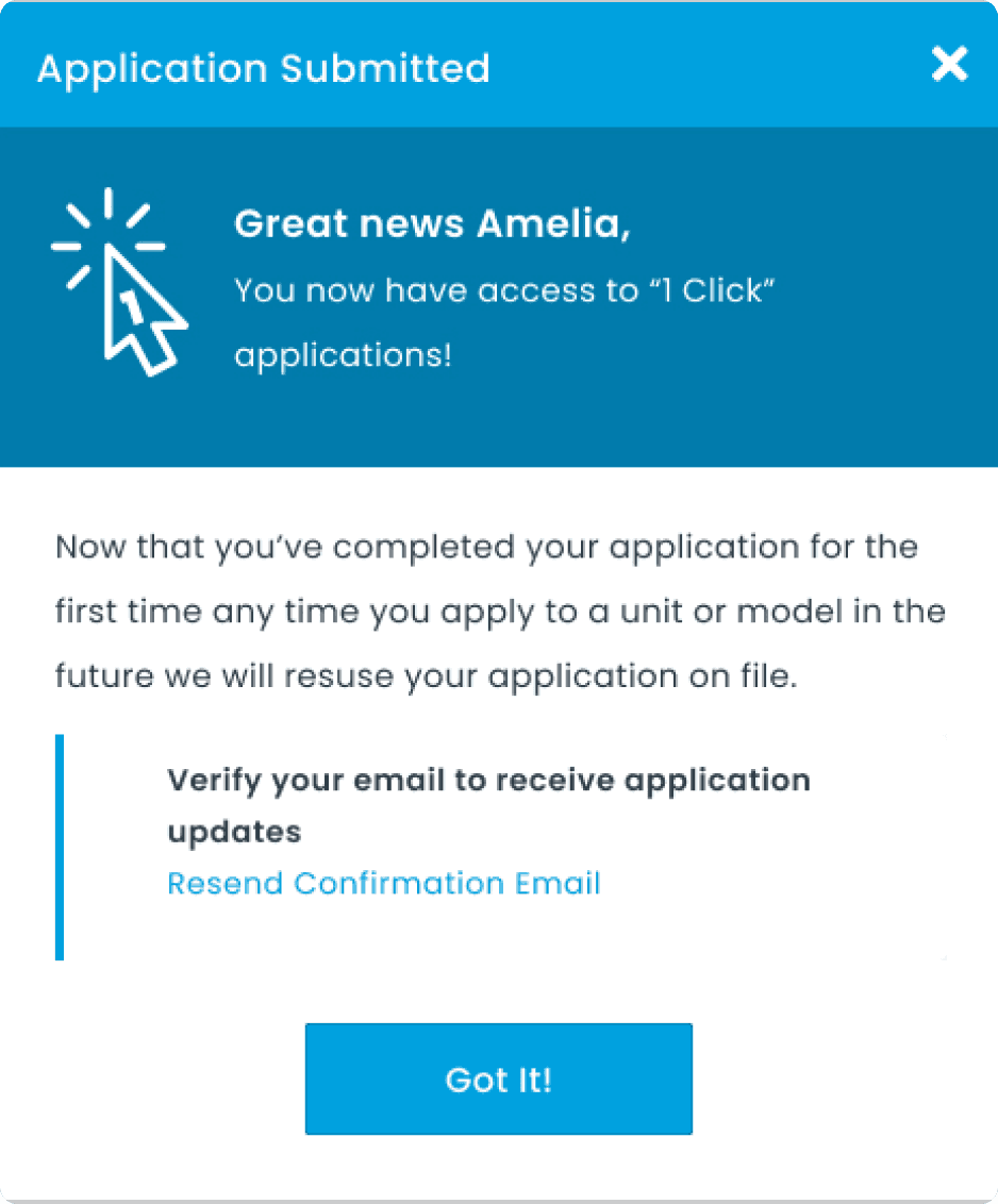
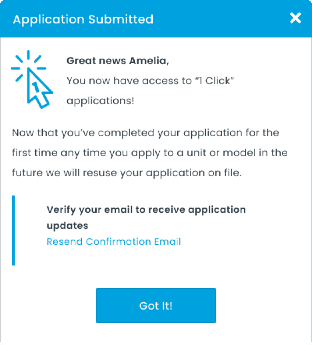
Here are the final designs after multiple design reviews and iterations influenced by business objectives and cross-functional collaboration.
Here are the final designs after multiple design reviews and iterations influenced by business objectives and cross-functional collaboration.
Branded CTAs
Branded CTAs
After spending a lot of time deciding how renters would discover the One Click application feature for the first time one point of consideration was how would they be reminded of the feature even though its a benefit that happens automatically when they complete any application work flow.
After spending a lot of time deciding how renters would discover the One Click application feature for the first time one point of consideration was how would they be reminded of the feature even though its a benefit that happens automatically when they complete any application work flow.
Once the product team was sold on tackling this problem alongside the additional project requirements I spent time exploring a few ideas. The reason I ended up pairing the iconography inside the button with the call-to-action was to leverage the principle of proximity as shown below.

Dynamic Success Modals
Dynamic Success Modals
Back to the topic of success modals as discussed earlier the modal designs we picked were really simple compared to previous explorations. My intention was to add delight and help with brand recognition but we went with function over form in this case. The question we asked ourselves was how much do we have to communicate for the feature to stick with renters.
Back to the topic of success modals as discussed earlier the modal designs we picked were really simple compared to previous explorations. My intention was to add delight and help with brand recognition but we went with function over form in this case. The question we asked ourselves was how much do we have to communicate for the feature to stick with renters.


