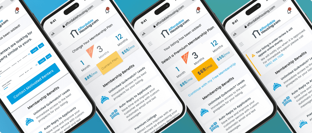
The core purpose of the Listing Upsell project is to educate first time Property Owners on the power of the Affordable Housing platform to help improve Premium conversion rates.
The core purpose of the Listing Upsell project is to educate first time Property Owners on the power of the Affordable Housing platform to help improve Premium conversion rates.
The core purpose of the Listing Upsell project is to educate first time Property Owners on the power of the Affordable Housing platform to help improve Premium conversion rates.
UX/UI Design
My Role
My Role
Collaborate with Affordable Housing Developers to see what impactful data we could pull from our database to communicate benefits of platform.
Collaborate with Affordable Housing Product Team to determine length and complexity of scope.
Update existing property listing flow and design new upsell experience.
Key Problems
Key Problems
Current upsell experience shows the ability to upgrade but not why users should upgrade.
Property status isn’t communicated clearly after listing a property and landing on the pricing page.
Secondary Research
Secondary Research
I allocated some of my time to conducting secondary research to learn what upsell techniques currently exist within other SaaS products.
I allocated some of my time to conducting secondary research to learn what upsell techniques currently exist within other SaaS products.
“Using customer data to upsell more is essentially about understanding who your customer is, and presenting the most appropriate product for them at that time.”
“Using customer data to upsell more is essentially about understanding who your customer is, and presenting the most appropriate product for them at that time.”
“Using customer data to upsell more is essentially about understanding who your customer is, and presenting the most appropriate product for them at that time.”
- Appointy
- Appointy
“Almost three quarters of salespeople who up-sell and 74% who cross-sell say that it drives up to 30% of their revenue.”
“Almost three quarters of salespeople who up-sell and 74% who cross-sell say that it drives up to 30% of their revenue.”
- HubSpot
- HubSpot
Proposed Solutions
Proposed Solutions
Use data to present relevant value propositions in the interface.
Crafting multiple page states to handle all scenarios for user account and property status.
New Workflow
New Workflow
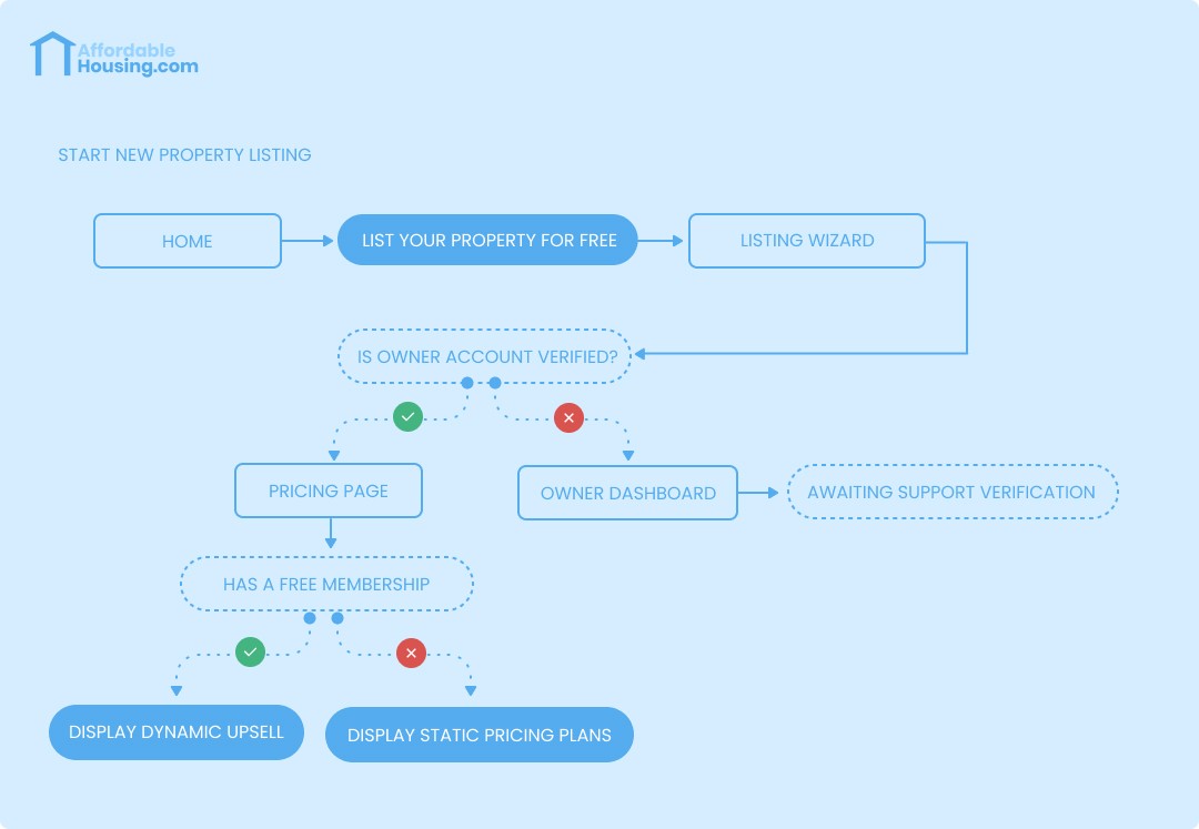
I chose to start my process with a flow diagram so that management and the product team were aware of any UX changes that could impact sales. Adjusting pricing pages can impact business objectives so I wanted to make sure everyone was equally bought in before investing any time with solutions or development.
I chose to start my process with a flow diagram so that management and the product team were aware of any UX changes that could impact sales. Adjusting pricing pages can impact business objectives so I wanted to make sure everyone was equally bought in before investing any time with solutions or development.
This diagram also enabled developers to gain insight into any potential issues with design solution feasibility as well as the ability to assess development effort vs design R.O.I.
This diagram also enabled developers to gain insight into any potential issues with design solution feasibility as well as the ability to assess development effort vs design R.O.I.


A Dynamic Experience
A Dynamic Experience
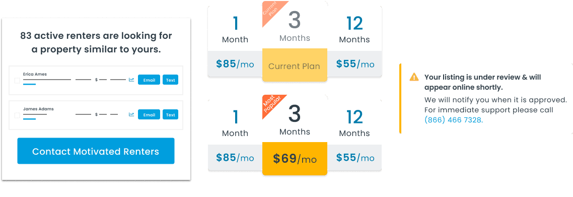
I played with the idea of creating components and copy variations to create a dynamic experience. The main reasons behind going with this approach is to easily handle multiple scenarios within the workflow and to also create a sense of intentionality and relevance for Property Owners.
I played with the idea of creating components and copy variations to create a dynamic experience. The main reasons behind going with this approach is to easily handle multiple scenarios within the workflow and to also create a sense of intentionality and relevance for Property Owners.
I played with the idea of creating components and copy variations to create a dynamic experience. The main reasons behind going with this approach is to easily handle multiple scenarios within the workflow and to also create a sense of intentionality and relevance for Property Owners.

Final Design Details
Final Design Details
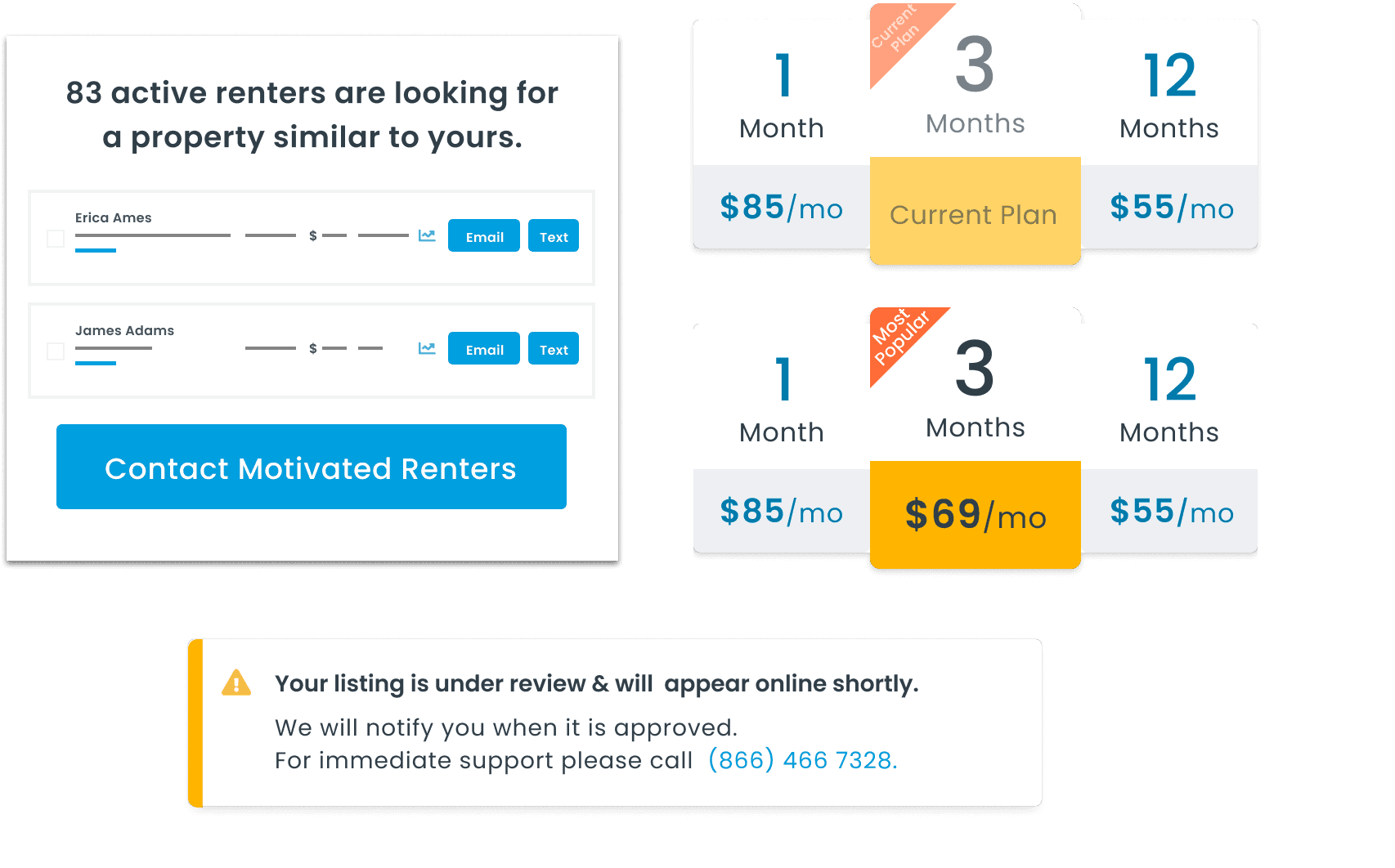
Here are the final designs after multiple design reviews and iterations influenced by business objectives and cross-functional collaboration.
Here are the final designs after multiple design reviews and iterations influenced by business objectives and cross-functional collaboration.
Data Driven Upsells
Data Driven Upsells
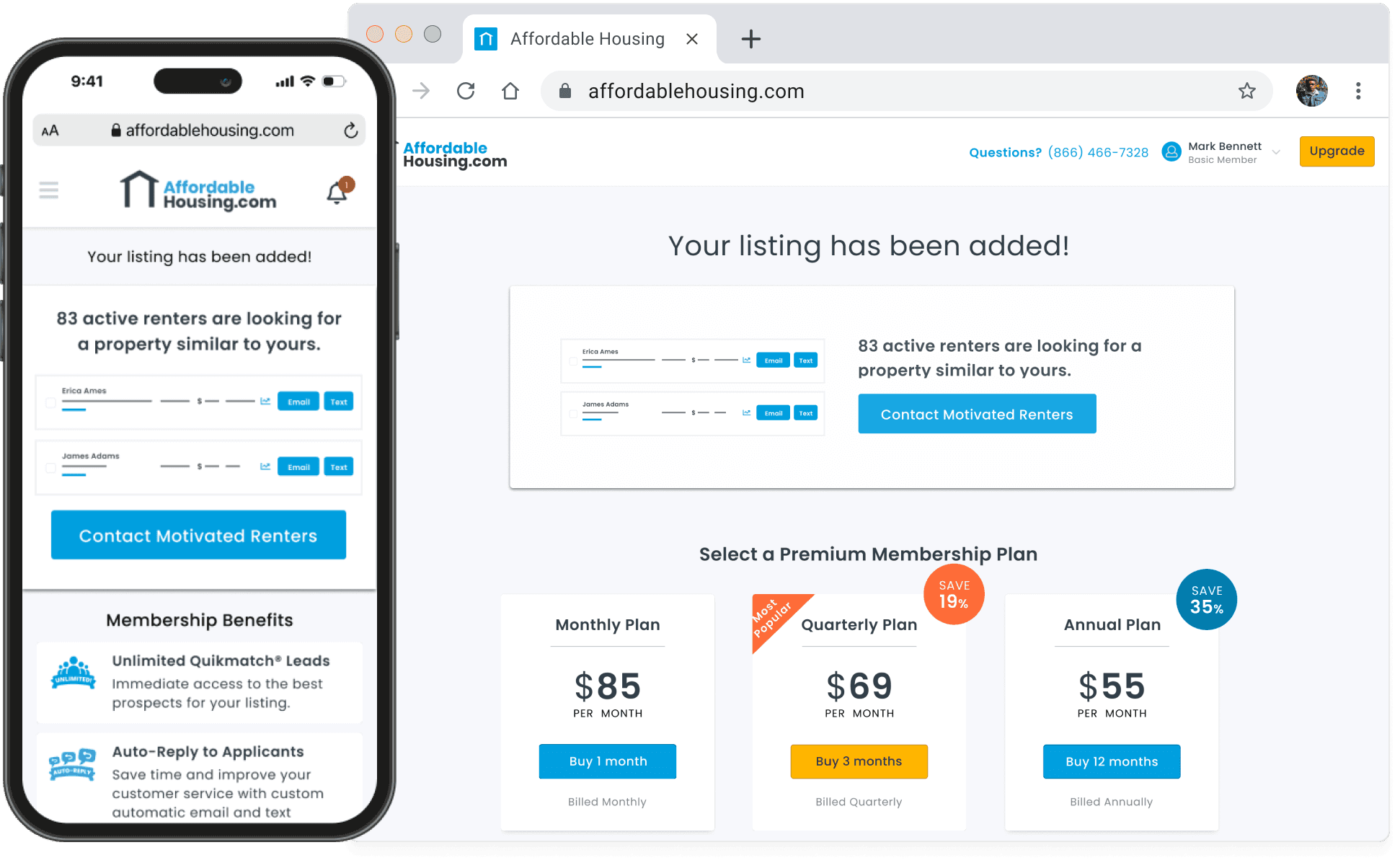
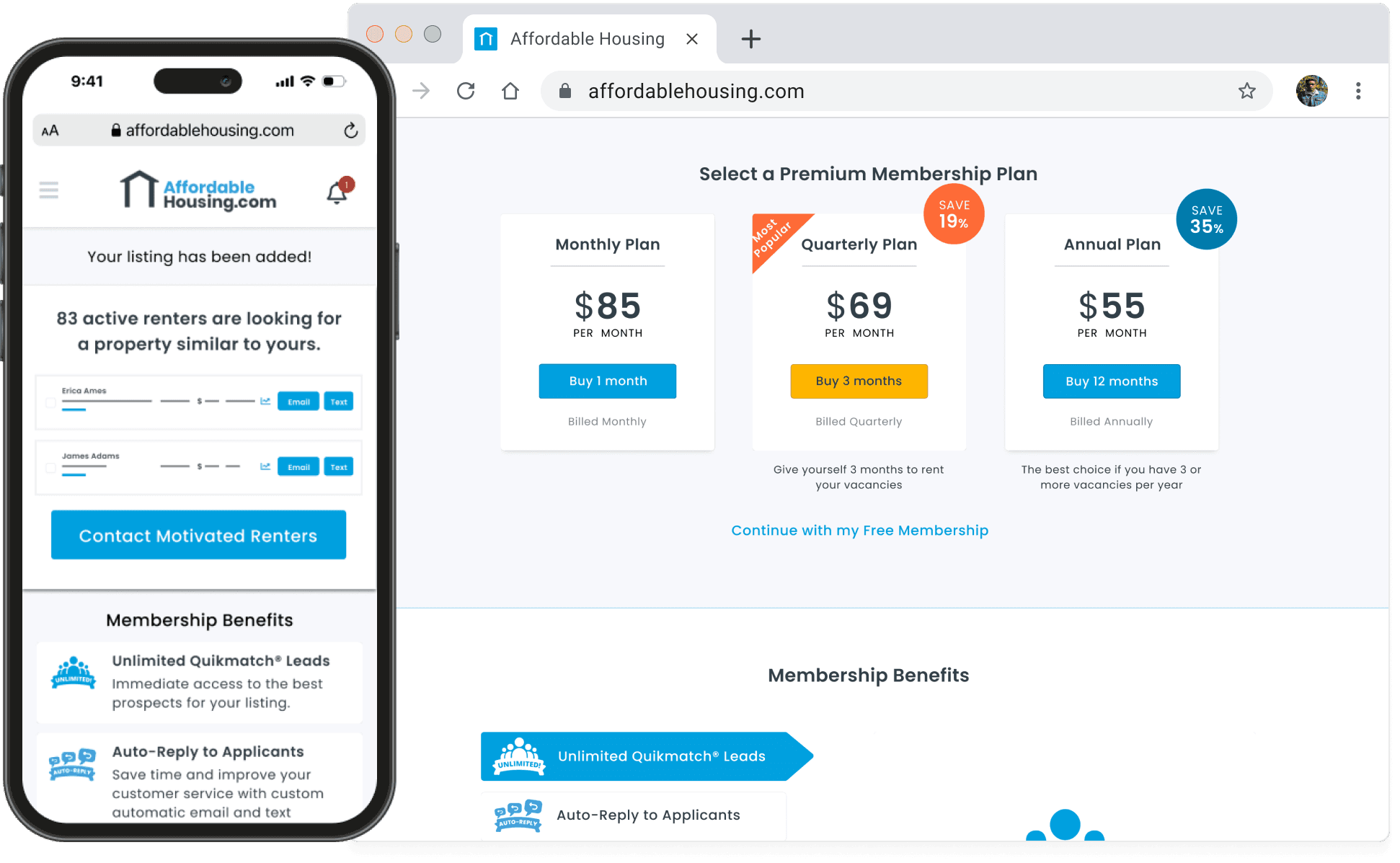
The whole user experience crafted for the new pricing page was centered around relevancy. Based on that decision the listing status and data we included were a focal point on the page. We leveraged the order of elements in the interface and also color contrast to accomplish this.
The whole user experience crafted for the new pricing page was centered around relevancy. Based on that decision the listing status and data we included were a focal point on the page. We leveraged the order of elements in the interface and also color contrast to accomplish this.
Continuity
Continuity
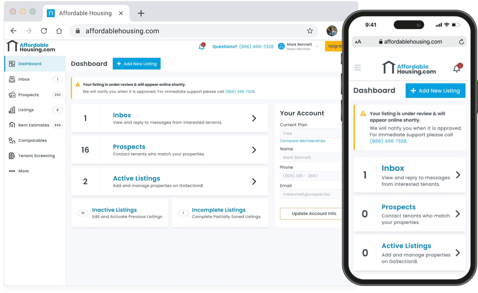
Another key piece of the user experience we crafted as a team involved bringing new status updates from the pricing page to the Owner Dashboard.
Another key piece of the user experience we crafted as a team involved bringing new status updates from the pricing page to the Owner Dashboard.
In the scenario where Owners have listings that need support team review we found it critical that if users sign out and revisit the web application later that they can quickly find their property listing status again. This status message goes away when their account is verified and the previously listed property is live on the results page.
In the scenario where Owners have listings that need support team review we found it critical that if users sign out and revisit the web application later that they can quickly find their property listing status again. This status message goes away when their account is verified and the previously listed property is live on the results page.


Upsell Design Variations
Upsell Design Variations
Here is a quick look at a few alternative designs that I explored and reviewed with my cross-functional team throughout the whole process. These designs were explored shortly after working on high level workflow diagramming and diverging with the product team.
The main reason these variations didn't make the cut was due to the composition of the pages feeling too busy with so many components in the view and some of the copy still felt too cold and lacked personalization. There were also too many opportunities present in view to take users out of workflow and lose focus. Actions like "Preview" that took away from the core user experience were removed from the final dev builds.


